Updated October 2026
As dental website design specialists, we analyze what makes practices stand out online, from conversion optimization to cutting edge user experience. Whether you are looking for dental website template inspiration or studying the best dental websites for your own practice, this 2026 roundup brings together standout examples we have discovered across the web and selected for their design, clarity, and performance.
1. Austin Dental Co
What Works:
- The video at the top of the page creates immediate personal connection. Seeing real team members builds trust before a single word is read
- Local Austin touches throughout position them as neighbors, not a corporate chain
- Calming blue color palette conveys honesty and medical professionalism without feeling cold
Key Takeaway:
Homegrown authenticity wins in dental website design. This site proves you don't need slick corporate polish when you have genuine local roots and a team willing to put their faces front and center.
2. Woodlands Endodontics
What Works:
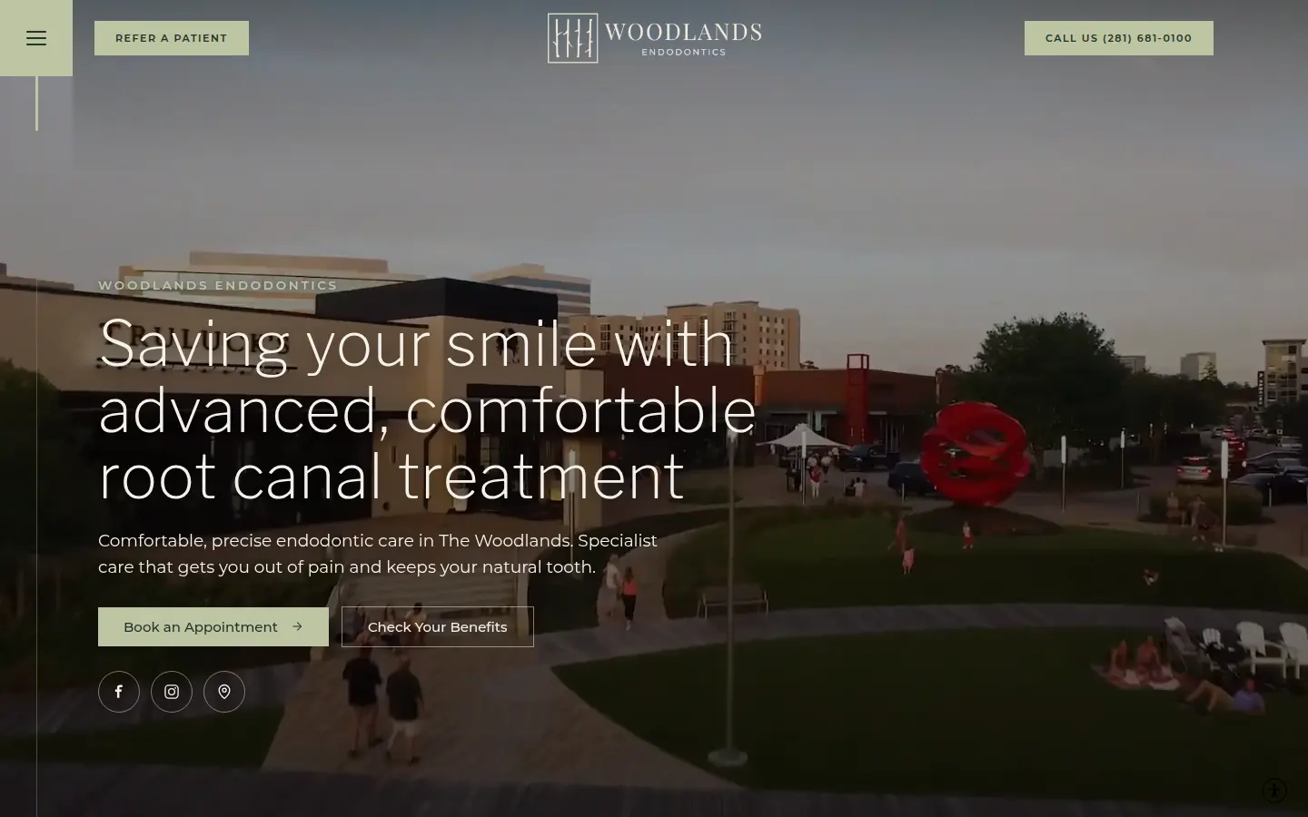
The hero is a video of the clinic. The headline sits on it in a thin, light sans: "Saving your smile with advanced, comfortable root canal treatment." One sentence underneath names the town and the aim of the visit. Get out of pain, and keep the tooth.
Book an Appointment opens a scheduler. Check Your Benefits sits beside it, for the person who wants an answer before a time. Refer a Patient and the phone number stay in the top bar, which suits a practice built on referrals. A short list along the left covers About, Services, For Patients, For Dentists, and Contact.
On a narrow screen the video runs edge to edge, and the benefits button becomes a tap-to-call link.
Key Takeaway:
The photograph stays quiet. The person in the chair and the dentist who sent them each get a button of their own.
3. Hello Tend
What Works:
- Modern, innovative office imagery showcases a fresh approach to dental care that feels more like a boutique wellness experience
- Minimal color palette creates a calming, premium feel that sets them apart from busy, cluttered competitor sites
- Appointment booking buttons appear in 3 strategic locations without feeling repetitive or pushy
Key Takeaway:
Disrupting traditional dental with tech-forward UX. Notice how they de-emphasize "dentist" language in favor of wellness terminology.
4. Nova Dental Care
What Works:
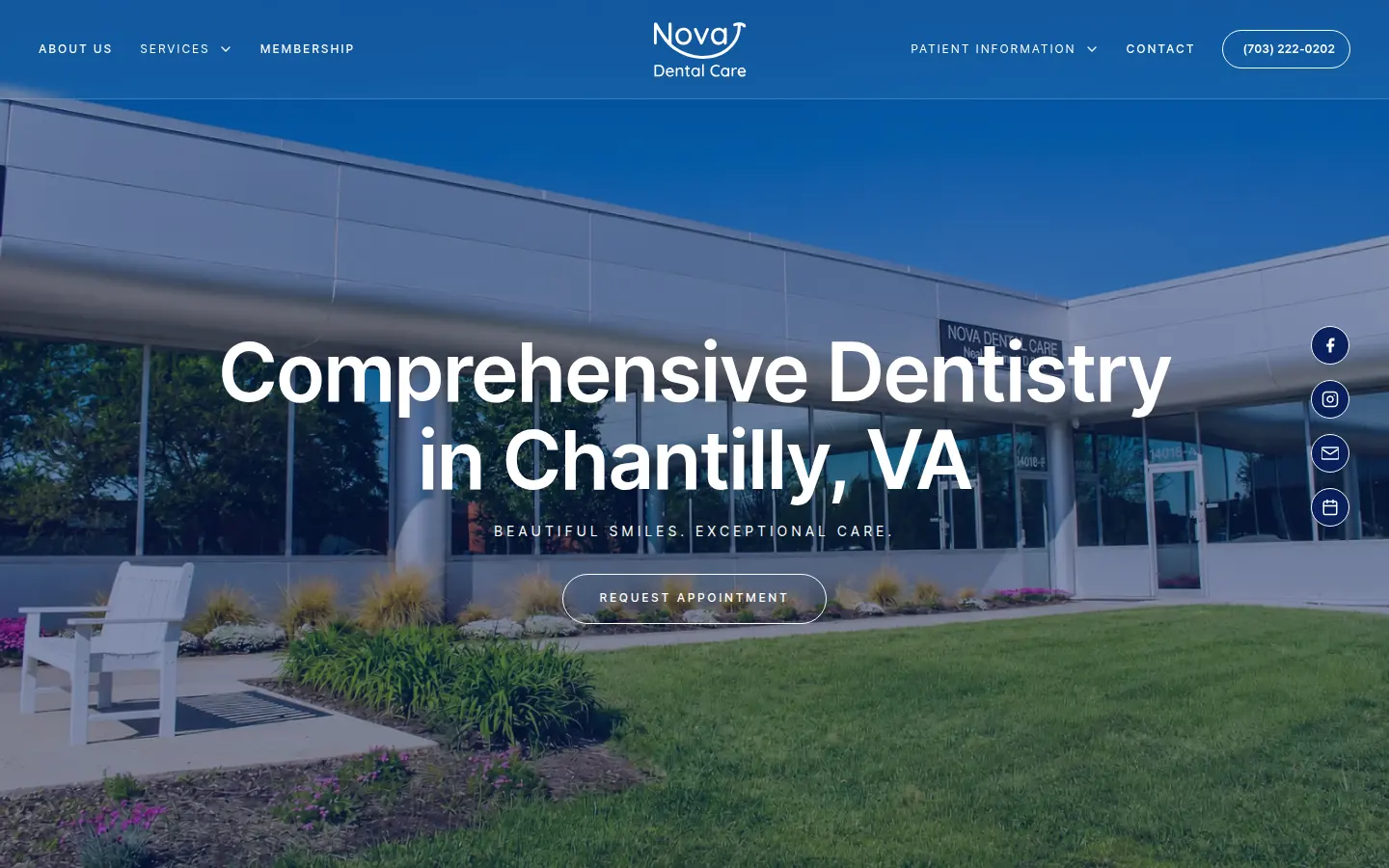
One sans, Inter, carries the screen. The headline is large, semibold, and centered: "Comprehensive Dentistry in Chantilly, VA." Beneath it, small capitals: "Beautiful smiles. Exceptional care."
A photograph sits under a blue wash, deep enough that the white type stays clear. Request Appointment is a single pill in the middle, and it leads to the contact page. The phone number shares the bar with About, Services, Membership, Patient Information, and Contact.
Key Takeaway:
The town, the offer, and one way to answer are all in view before you scroll.
5. Bates Dental Care
What Works:
- The large image at the top of the page features an iconic local landmark instantly recognizable to anyone in the area, creating immediate hometown connection
- Modern design elements balanced with traditional accents help connect with their established patient base of over 20 years
- "Personal touch" messaging throughout emphasizes real connection over transactional dentistry
Key Takeaway:
Long-term patient relationships are the ultimate trust signal in dental website design. Bates leverages multi-decade patient testimonials as social proof that speaks louder than any marketing copy.
6. Chandler Park Dental Care
What Works:
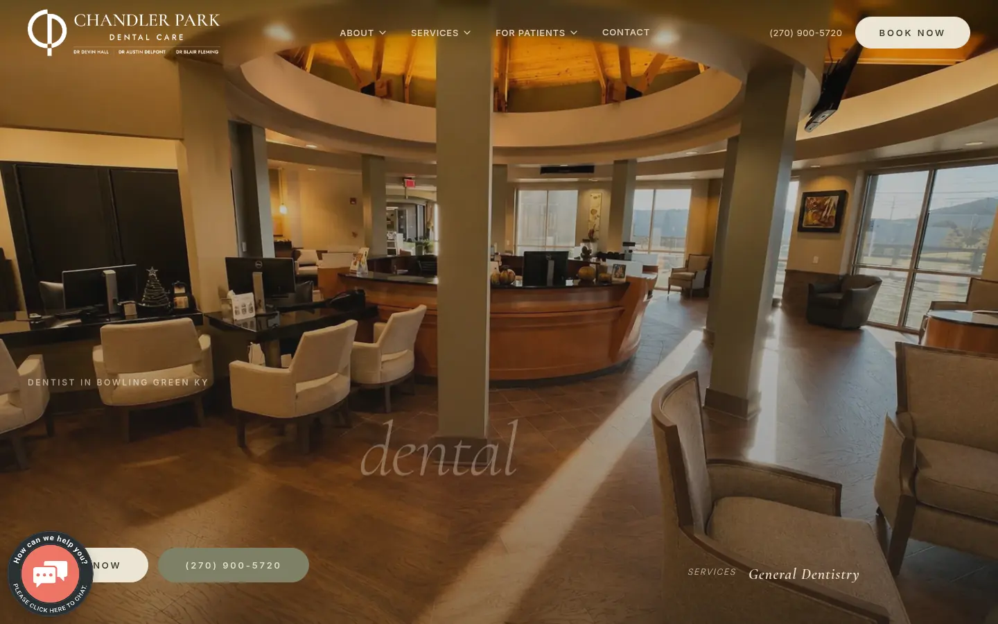
The photograph runs the full width. Low on it, a light serif at display size, in lowercase: "comforting dental care beautiful results." The word dental is italic. The line is long enough to cross most of the screen.
The bar above is plain. About, Services, For Patients, Contact, the phone number, and a Book now pill that leads to the contact page. The logo is the only mark on the left.
Key Takeaway:
The first word is comforting, set large enough to be the point of the screen.
7. Tooth Bar
What Works:
- Bold, Austin-quirky branding sets them apart from generic cosmetic dental practices
- Before/after gallery immediately builds trust by showcasing real results
- Strong Instagram integration extends the brand experience beyond the website
Key Takeaway:
Personality-driven design works exceptionally well for cosmetic dentistry. They're selling confidence, not just cleanings.
8. Essex Street Dental Medicine
What Works:
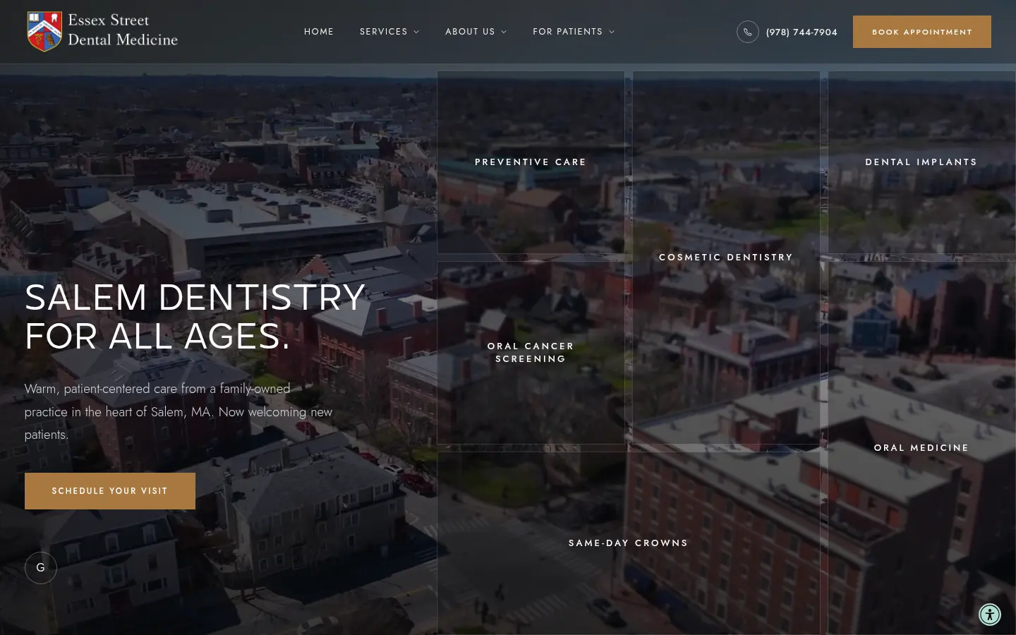
Two lines, in capitals, set at the left over a full-width video: "Salem Dentistry" and "For All Ages." The type is white. The logo sits opposite a phone number and a Book Appointment pill.
The menu is four items. Home, Services, About Us, For Patients. The pill goes to the contact page. On a phone, this hero is a still of the Hawthorne statue downtown, with the same headline.
Key Takeaway:
The name of the city is the headline. The rest of the screen stays out of its way.
9. Pagosa Peak Family Dentistry
What Works:
- Mountain imagery woven throughout the site tells the story of their Colorado location and connects with local patients
- Stories. Smiles. Skills tagline creates memorable brand identity and structures the entire site experience
- Husband-and-wife ownership story builds authentic trust. Visitors see real people, not a faceless corporation
Key Takeaway:
Relationship-first branding done right. This site proves that small-town practices can compete with big-city polish when they lean into authentic storytelling and genuine community roots.
10. Pearl Palm Beach Dental
What Works:
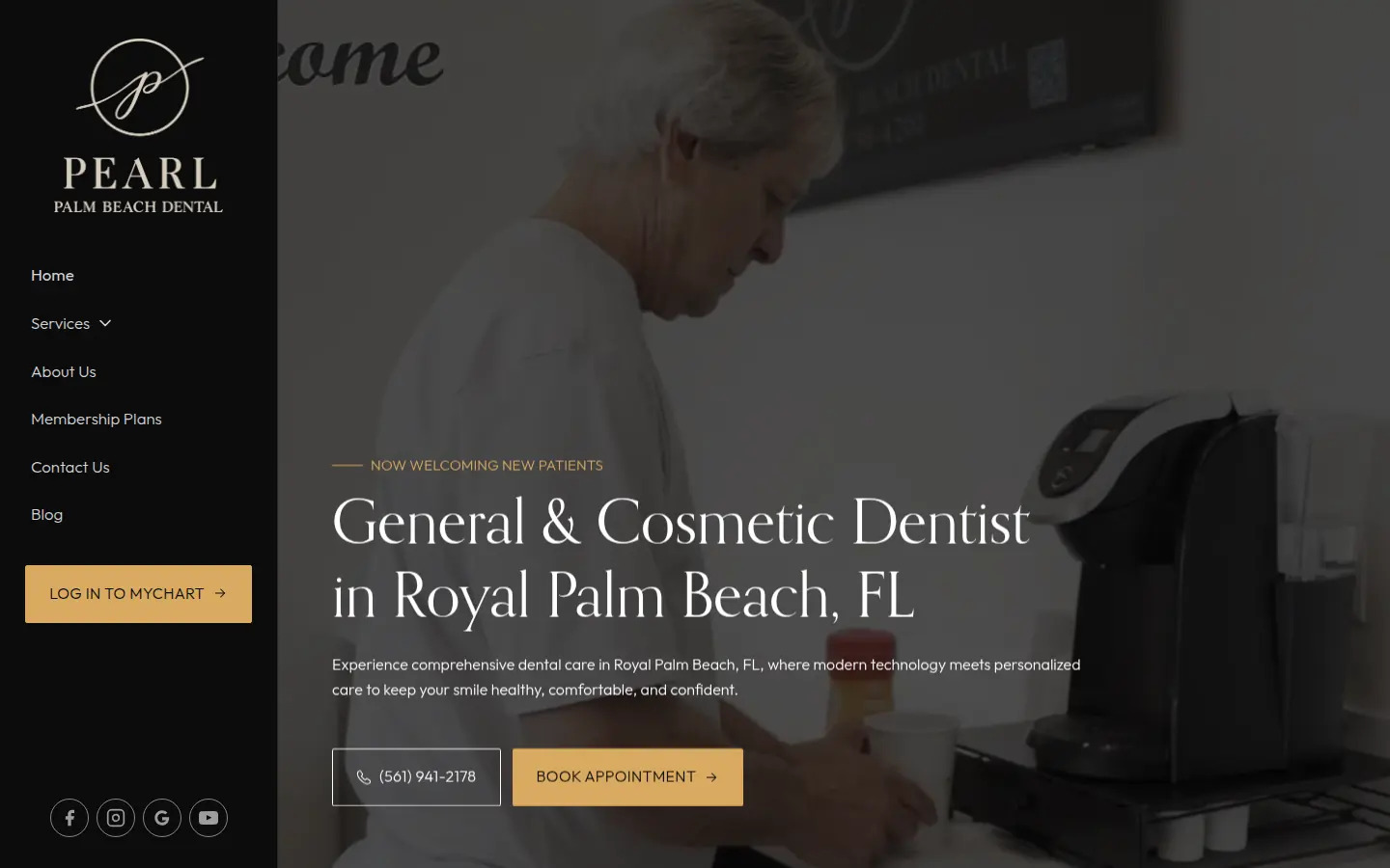
The navigation is a column down the left. Home, Services, About Us, Membership Plans, Contact Us, Blog, and a MyChart login. The map of the site is already on the screen.
The rest is video. The headline is a light display serif: "General & Cosmetic Dentist in Royal Palm Beach, FL." The phone number and Book Appointment sit under it. That button opens the practice's online schedule.
Key Takeaway:
You can see where the site goes, and you can book, before you scroll.
11. Cosmetic Dental Studios
What Works:
- Celebrity dentist positioning with Dr. V's personal brand creates aspirational appeal for high-value cosmetic patients
- Before & after gallery prominently featured above the fold. Transformative results speak louder than any copy
- Media credentials (TLC, Allure, Men's Health) establish instant credibility and social proof at scale
Key Takeaway:
The blueprint for luxury cosmetic dentistry marketing. Dr. Veytsman understands that high-value patients buy transformation and prestige, not procedures. Every element screams exclusivity.
12. Muldoon Dental Arts
What Works:
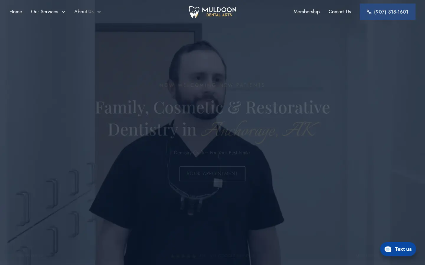
A dark video fills the screen. The headline is centered, in a serif: "Family, Cosmetic & Restorative Dentistry in Anchorage, AK." A shorter line under it reads "Dentistry Crafted For Your Best Smile." The wordmark sits above the headline, in the middle.
Book Appointment is centered beneath the lines and goes to the contact page. The bar is white type on the video: Home, services, about, membership, contact, and the phone number.
Key Takeaway:
The video is the room. The type names the care and the city.
13. Elegant Pediatric Dentistry
What Works:
- Soft pastel color palette (pinks, purples, teals) creates calming, modern aesthetic that appeals to millennial parents
- Playful yet elegant design strikes perfect balance—fun enough for kids, sophisticated enough for parents' trust
- Board-certified credentials prominently displayed build immediate credibility with research-focused parents
Key Takeaway:
Modern pediatric dentistry marketing at its finest. Elegant proves you can be playful and professional simultaneously—gentle colors and thoughtful design ease parental anxiety while creating kid-friendly vibes.
14. Method Modern Dentistry
What Works:
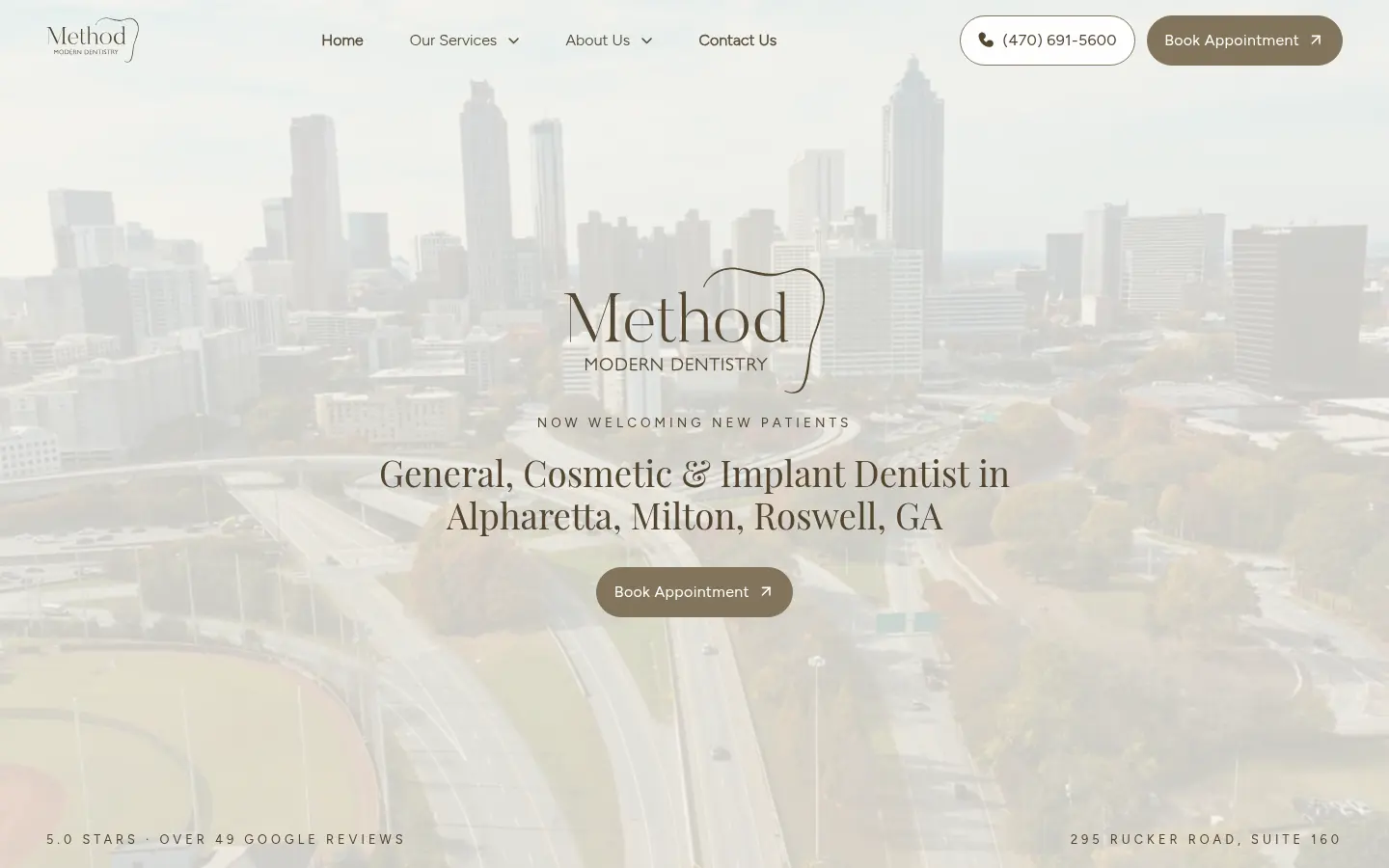
The frame is full width and very light, close to paper. The headline is a brown serif, set modestly in the middle: "General, Cosmetic & Implant Dentist in Alpharetta, Milton, Roswell, GA."
Book Appointment is in the bar and again under the headline. The link opens a scheduler. The bar itself is short: Home, services, about, contact, and the phone number.
Key Takeaway:
Three towns in one line, and the same button twice, so the way in is obvious.
15. The Dental Method
What Works:
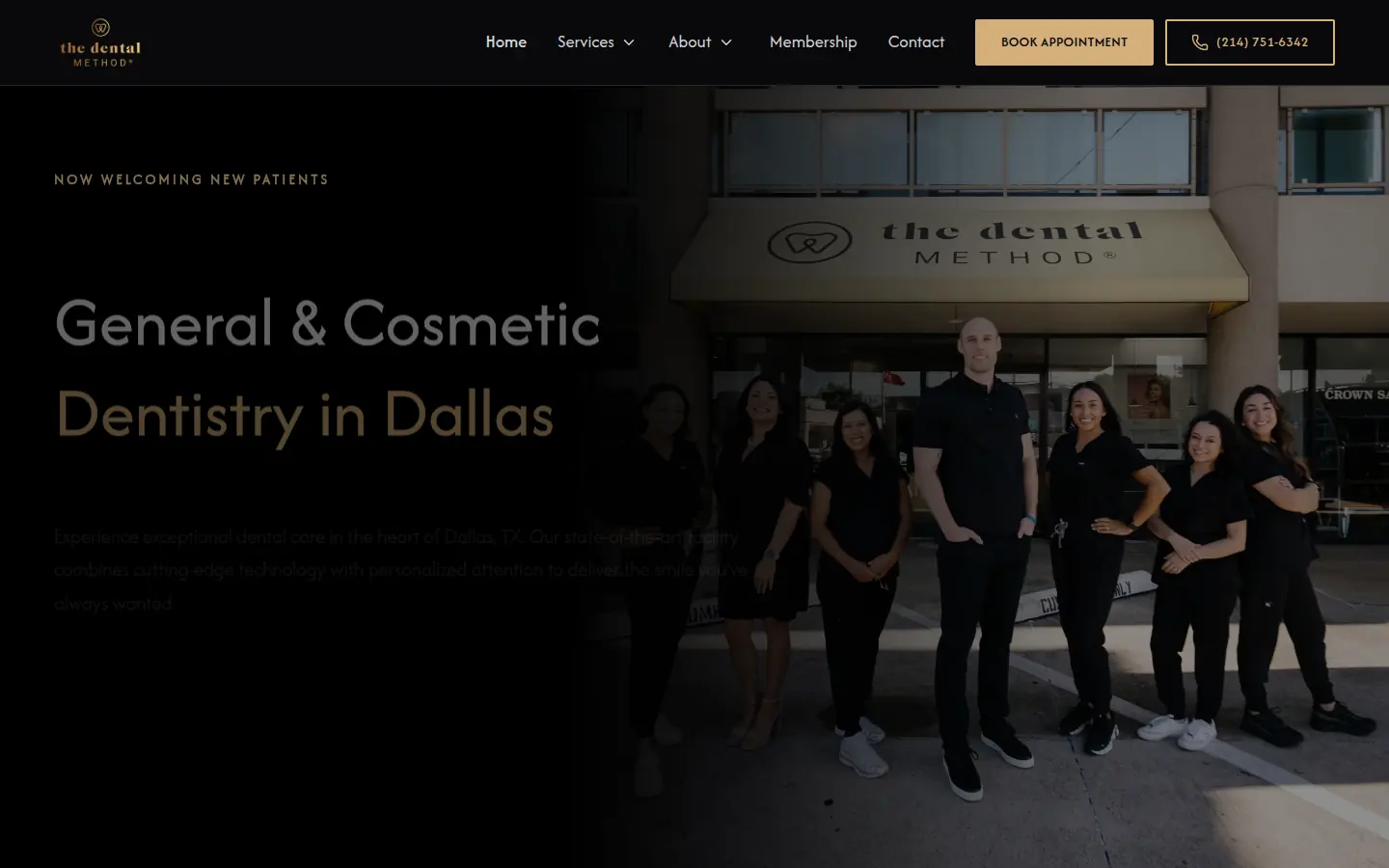
The first screen is type on black. The logo is small, at the left, and the headline is large and white, in the same sans as the menu: "General & Cosmetic Dentistry in Dallas."
Book Appointment sits under the headline. The phone number beside it is gold, so it reads as a second door. The same pair is repeated in the top bar, with Home, Services, About, Membership, and Contact.
Key Takeaway:
Name, button, number. On a black field, that is the whole design.
16. The Tiny Tooth Co
What Works:
- Playful branding strikes perfect balance. Fun enough for kids without looking unprofessional to parents
- Bright, energetic color palette and custom illustrations create a welcoming, anxiety-free environment
- Clear messaging addresses parent concerns (gentle care, experienced team) while keeping tone light
Key Takeaway:
Pediatric dental website design must speak two languages simultaneously. The Tiny Tooth Co creates a brand identity that excites children while reassuring parents.
You just studied sixteen great websites. Yours noticed.